SHENG DENG (Stock Trading Mobile Application)
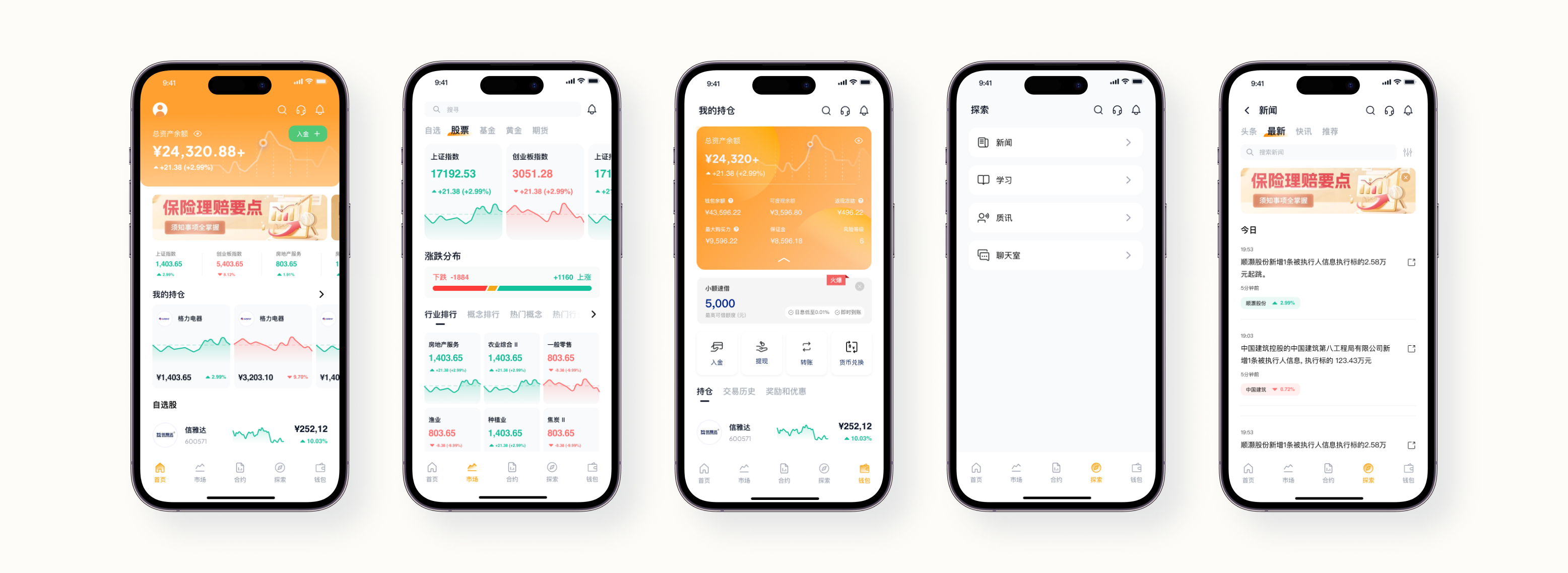
Revamping Financial Insights: Stock Trading App Redesign01. Home Screen
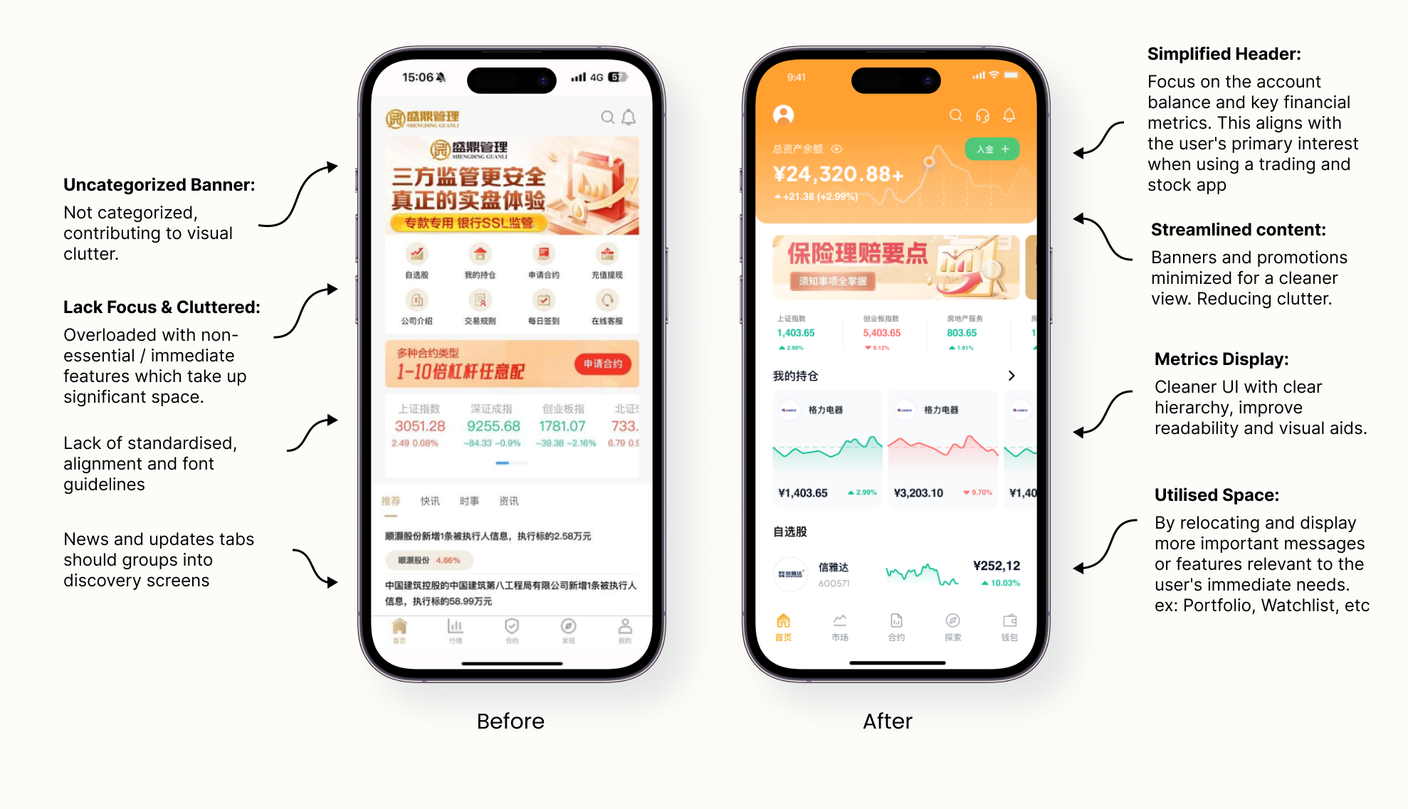
Header Section:
Simplifying the header and categorizing information makes the key details more accessible and reduces cognitive load. Users can immediately see their account balance and important metrics without distraction.
Main Content Area:
Users are primarily concerned with their investments and assets when they first open the app. By emphasizing these elements, the app meets the fundamental need of providing immediate insight into the user's financial status.
Misplaced Priorities:
The original home screen included multiple features, some of which were not essential at the initial user interaction. The redesigned home screen emphasizes the user's asset amount and portfolio, aligning with user priorities when using a trading and stock app. This change ensures that users can quickly check their financial status and investment performance upon opening the app.
Relocated and utilised space:
Moving the news and updates tabs to a separate discover screen allows the home screen to focus on displaying critical information and features. This delivers a clearer message to users and enhances their initial experience with the app by showing them what they care about most— their financial portfolio, watchlist and etc.
02. Market Overview Screen
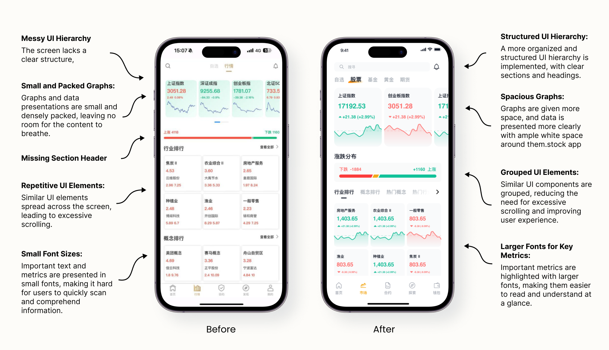
Grouping Repeated UI Elements:
The original design included multiple sections with similar UI elements scattered across the screen, resulting in excessive scrolling. The redesigned screen groups similar components together, reducing scrolling time and improving user efficiency.
Improving Graph and Data Presentation:
The graphs and data in the original design were small and densely packed, making it difficult for users to analyze trends. In the redesign, graphs are given more space and presented clearly, with ample white space to improve readability.
Increasing Font Size for Key Metrics:
Important metrics in the original design were presented in small fonts, making them hard to read quickly. The redesign highlights key metrics with larger fonts, enhancing visibility and allowing users to scan information easily.
Incorporating More Graphical Elements:
The original interface was dominated by text, with few graphical elements. The redesigned screen incorporates more graphs and charts, making the data more engaging and easier to understand.
03. Account/Wallet Overview Screen
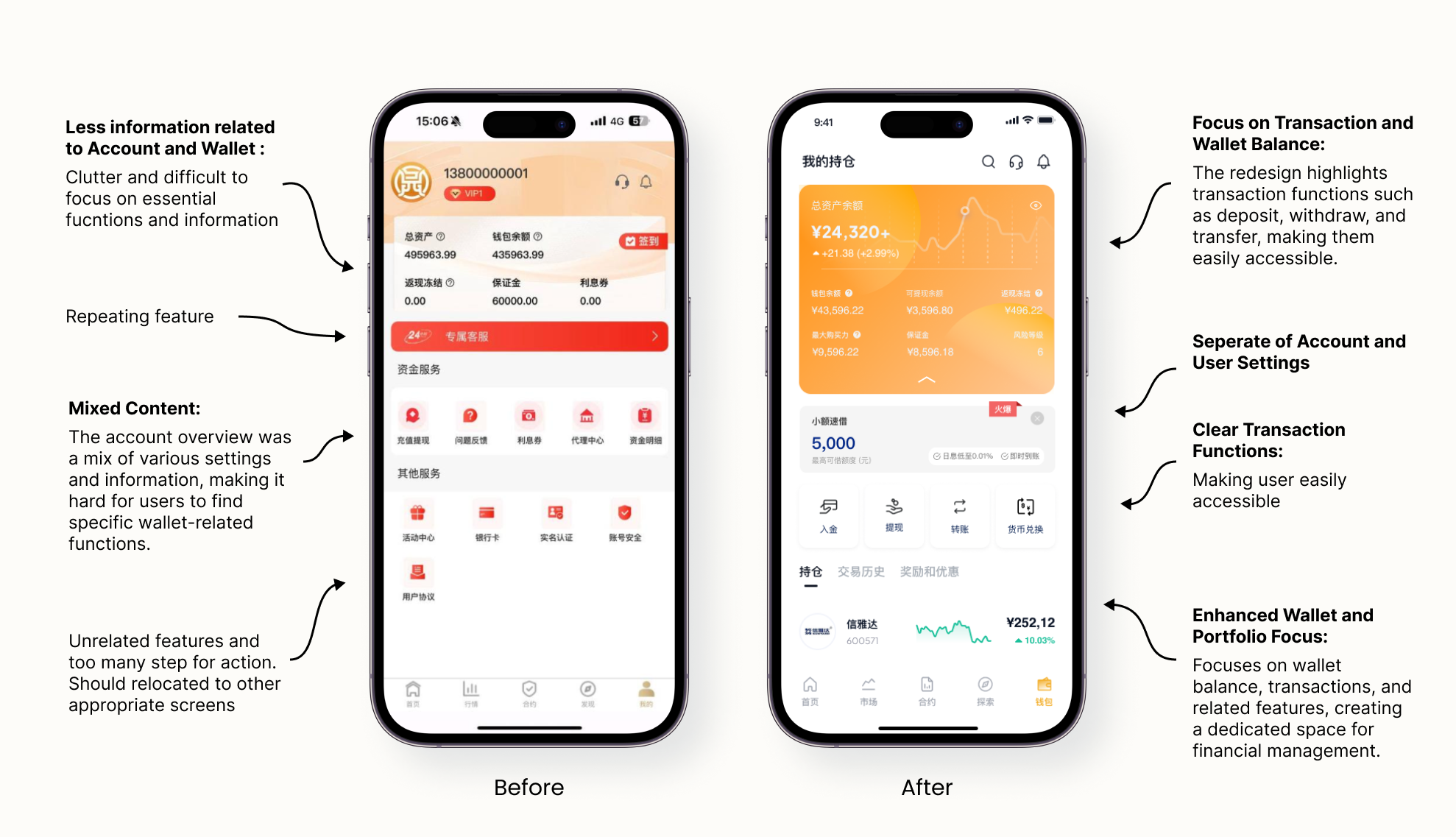
Separation of Account and User Settings:
The original screen combined account information with user settings, leading to a cluttered and confusing interface. The redesign separates these functions, placing account-related features on the account overview screen and relocating user settings to the main page's top header. This separation declutters the interface and ensures that users can easily access account functions without unnecessary distractions.
Enhanced Focus on Transactions and Wallet Balance:
The original layout made it difficult for users to quickly find essential functions such as deposit, withdraw, or transfer. The redesigned screen prioritizes these transaction functions, making them easily accessible and prominent. This change ensures that users can perform critical financial activities quickly and efficiently.
Relocation of Unrelated Features:
The original screen included several unrelated features that added to the clutter. These features have been relocated to other appropriate screens, such as the user settings page, streamlining the account overview screen and keeping it focused on wallet and portfolio-related activities.
Dedicated Wallet and Portfolio Focus:
The new design creates a dedicated space for managing wallet balance, transactions, and related features. This alignment with user expectations and needs provides a clear and straightforward interface for financial management.
04. Discovery Screen
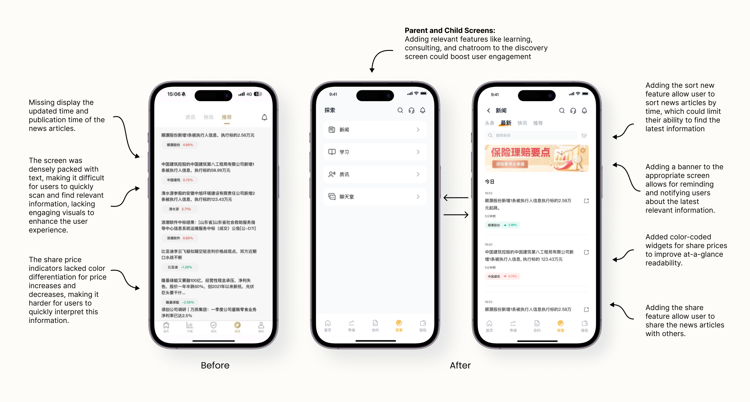
Missing Critical Information:
The original screen lacked essential details like update times and news timestamps, which are crucial for user context. By added update times and timestamps to provide users with the necessary context about the news, ensuring they stay informed with the most recent updates.
Enhanced User Interaction Features:
The original design did not allow users to sort news by time or share news articles, limiting user engagement.By introduced sorting features to organize news by time and added a sharing feature, enabling users to easily share news articles with others.
Parent and Child Screen Structure:
The discovery screen was static and did not encourage user engagement with different features. By developed a parent and child screen structure within the discovery screen, allowing users to interact with various features more effectively and enhancing user engagement.
Visual Indicators for Share Prices:
The original share price indicators were monotone, making it difficult for users to quickly interpret changes. By incorporated color-coded widgets for share prices (green for increase, red for decrease) to improve at-a-glance readability and user experience.