Smart Reward
A Multilevel E-commerce Platform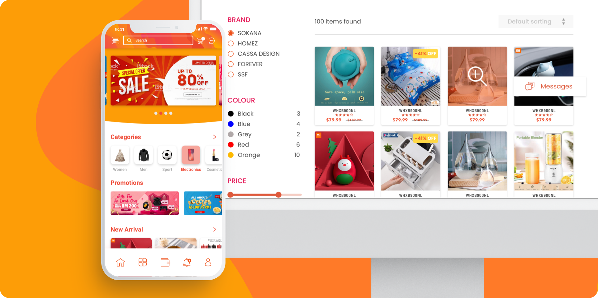
01. Overview
"Smart Reward" is a multi-level member reward e-commerce platform. It was designed to boost organizational loyalty and user engagement through a unique rewards system, tailored forthe Southeast Asian and Malaysian markets.
Client
Smart Reward - IsCity Sdn BhdRole
UI/UX Design (Mobile & Web Design)Front-end Developer
Timeline
May 2020 — May 2021Tools


02. Business Objectives
When we started the 'Smart Reward' project, I was deeply involved in defining the business objectives alongside my team and key stakeholders. We were determined to transform the e-commerce experience for our MLM community in Southeast Asia.
Methodology:
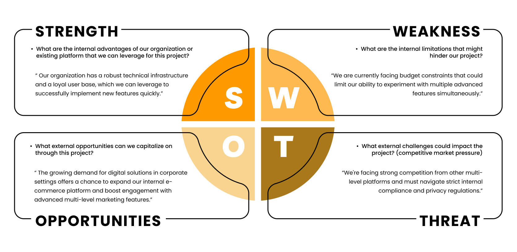
To align our project with these ambitious goals, we conducted stakeholder interviews, which I led, gathering insights that would ground our objectives. We also held strategy sessions where we mapped out our approch using SWOT analysis to better understand our strenghts and the challenges ahead.
Objectives:
After conducting detailed meetings with stakeholders, we synthesized thier insights and feedback to formulate clear objectives and business goals for this project. These objectives include:
Increase Member Engagement:
Our goal was to create a platform so engaging that it would become a daily destination for our users. Boost daily active users by 25% within the first year of launch.Enhance Operational Efficiency: Streamline the reward management and referral processes, reducing overhead and improving the overall user experience.
Foster Organizational Loyalty: Build a platfrom that felt like a community was essential to deepening our users connection to the brand.
03. Problem Statements
Our journey into the heart of the 'Smart Reward' project revealed a landscape filled with challenges that my team and I were determined to overcome. From the outset, it was clear that a deep understanding of the problems we faced was crucial for crafting effective solutions. Here, I share the pivotal issues we identified through our user research, and the personal resolve I felt to address them.
Key Problems:
Complex Reward Management
Problem: Users find the current reward systems on similar platforms overly complex and difficult to understand, especially when managing different types of rewards and transactions. There is a need for a system that simplifies these processes while maintaining transparency and usability.
Impact: This complexity leads to reduced user engagement and satisfaction as member struggle to maximize the benefit of the reward programs
Insufficient Referral Tracking
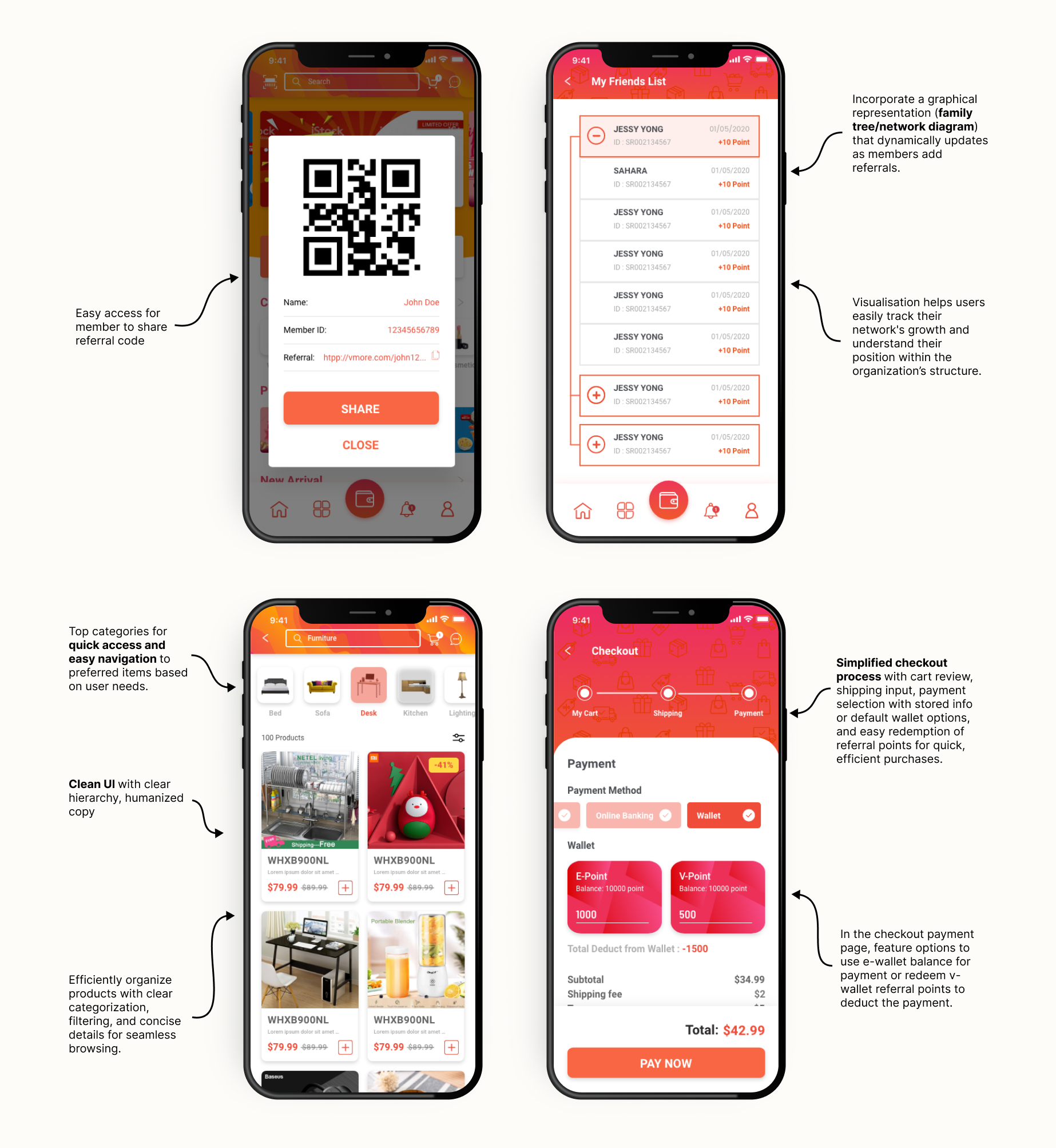
Problem: Existing MLM platfrom do not provide enough tools for users to effectively track thier referrals and the benefits derived from them. Users require a more intuitive and visual approach to understand thier network's growth and reward structure.
Impact: This complexity leads to reduced user engagement and satisfaction as member struggle to maximize the benefit of the reward programs
Navigation and Usability Issues
Problem: Users often experience frustration due to poor navigation and interface design, which make it difficult to find necessary information and complete transaction smoothly.
Impact: Poor usability can lead to increased user errors, decreased satisfication, and higher abandonment rates, affecting the overall success of the platform.
Limited Payment Flexibility
Problem: Current platfrom often offer limited payment options, which do not cater to the diverse preferences of a broad user base, including different financial situations and access to payment methods.
Impact: This limitation can prevent potential user from fully engaging with the platform, thus limiting market expansion and user inclusivity.
Conclusion:
Each problem statement has been carefully derived from user input and market analysis to ensure that our solutions are directly addressing the real challenges faced by our users. In the subsequent sections, we will explore how our design proposals specifically tackle these issues to create a more user-friendly e-commerce experience.
04. User Research
As we embraked on the 'Smart Reward' project, our team prioritized understanding our users deeply. My role involved coordinating and synthesizing our collective research efforts to ensure that every feature we designed met user needs.
Reseach Methods and Tools:
We utilized Google Forms to conduct comprehensive surveys. The survey was crafted to guage general user preferences and expectations for a new e-cormmerce platform, specifically focusing on what features they considered most crucial. Question example such as:
We distributed this survey via email to all registered members of the organization, achieving a significant engagement with responses from over 200 members.
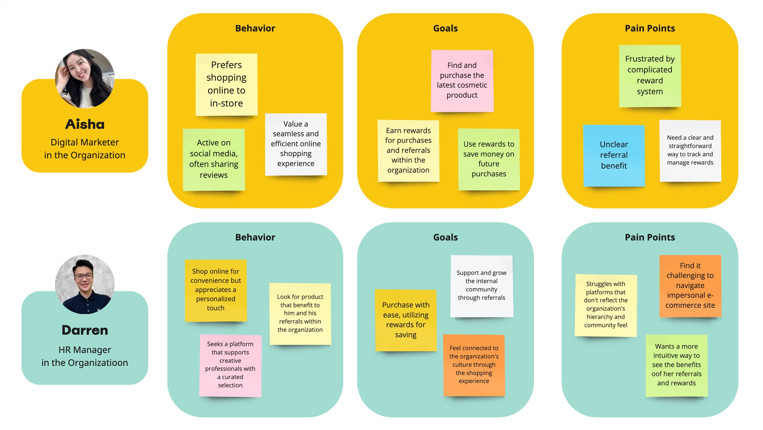
User Persona
From this rich pool of data, we developed detailed user personas that encapsulated the diverse characteristics of our potential users.
Research Findings and Conclusions:
The research indicated a strong demand for an intuitive, feature-rich platform that could support a multi-level marketing structure without overwehelming the users.
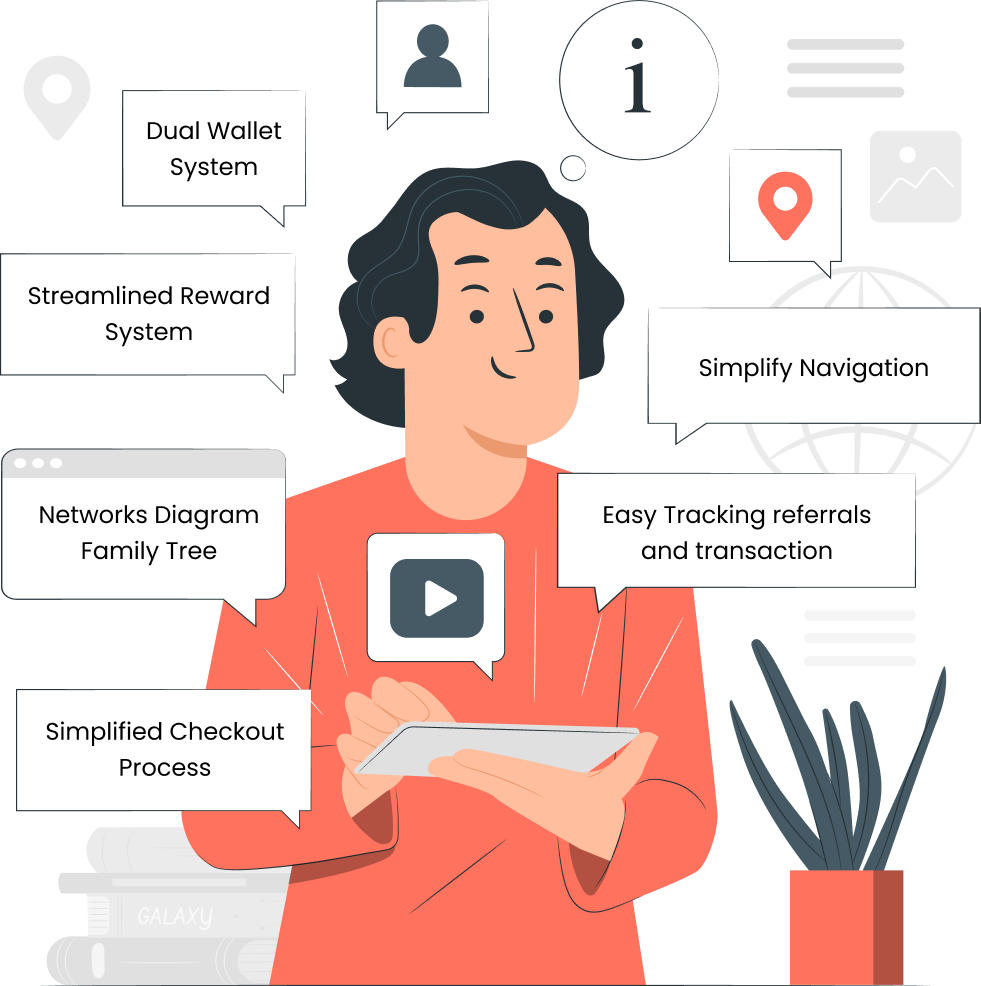
Key desired features:
- Streamlined rewards management system
- Easy-to-navigate interface
- Dual wallet system
- Networks Diagram to easily track network growth within the organizatoin
- Easy tracking referrals and transaction
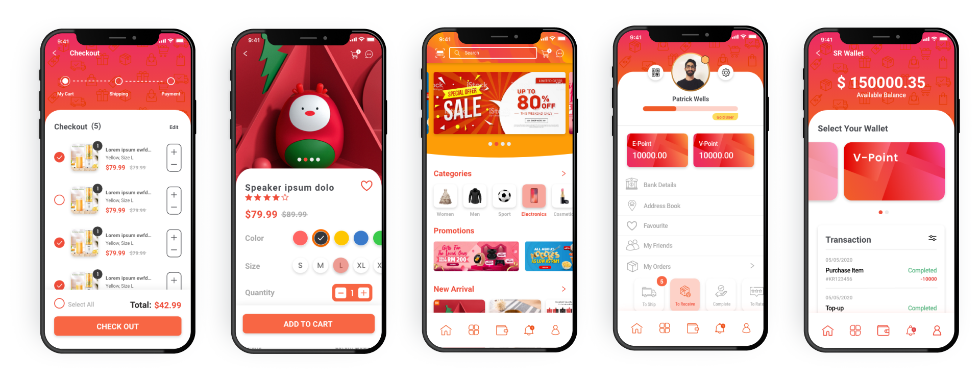
- Simplified Checkout Process
Conclusion:
The insights gained from our user research phase were instrumental in shaping the initial design and development of 'Smart Reward'. By listening to our users and understanding thier challenges and needs, we were able to propose solutions that were not only innovative but also directly aligned with user expectations. These findings guided our subsequent design decisions, ensuring that we built a platform that truly resonated with out target audience..
05. User Goals
Following our in-depth user research, our team was poised to translate the insights we had gathered into tangible design objectives. My role invloved closely collaborating with my colleagues to ensure that the goals we set would address the core needs of our users and enhance thier experience on the 'Smart Reward' platform.
Define User Goals
Through the synthesis of feedback from surveys and members interview, we defined several critical user goals that would guide our design and development efforts:
Simplified Reward and Referral Management
Our users desired a straightforward way to manage thier rewards and referrals. Our response is to design an intuitive dashboard where functionalities related to managing the dual wallet system - seperating cash transactions and reward earnings - are prominently accesible and easy to navigate.Easy and Clear Navigation
One clear message from our user interviews was the frustration with navigating exising platforms. Our goal became to create a user interface that felt like second nature to navigate. I contributed by mapping out user flows that would minimize clicks to complete tasks, ensuring that essential functions were easily accessible.Intuitive and Accessible Interface
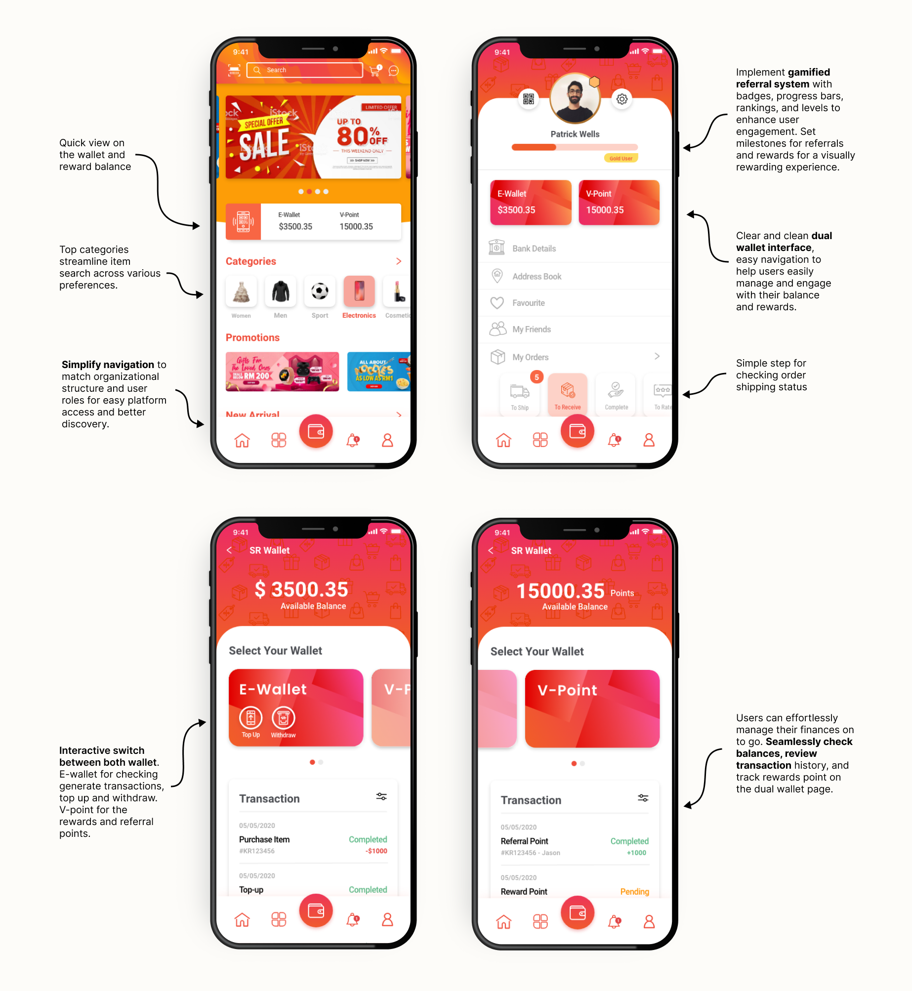
Catering to our diverse user base, from tech novices to savvy users, it is critical to develop an interface that is universally intuitive. This invlolves simplified interaction designs that accommodate all levels of user experience, ensuring the platform is accessible and straightfoward for every member.Dual Wallet System
A dual wallet system was a feature strongly desired by our community. It was important to me that this feature be designed to clearly distinguish between accessible funds and reward point. I proposed visual and functional separations in the wallet interface, ensuring users could effortlessly manage both type of resources.Conclusion:
The user goals we set for 'Smart Reward' were not just heoretical targets; they were a roadmap that guided every decision decision we made. Contributing to this process taught me the importance of empathy in design - truly understanding and addressing user needs is crucial to creating a product that resonates with its audience.
06. Design Process
Building upon the foundational research and clearly defined user and business goals, our design process focused on creating a user-centric and innovative "Smart Reward" platform.
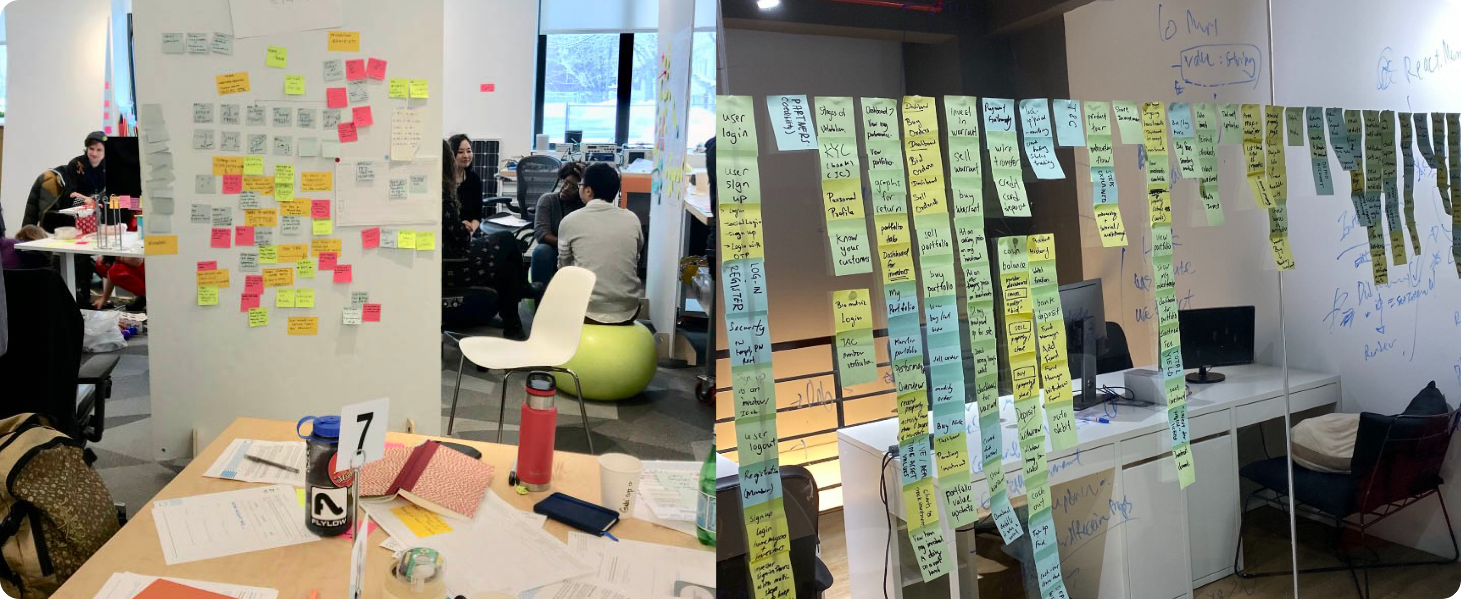
01. Concept Development
My team and I conducted brainstorming sessions to visualize ideas quickly. Starting with basic sketches, we moved to creating detials wireframes and then intractive prototypes. Tool like Adove XD, InVision, Miro were invaluable.
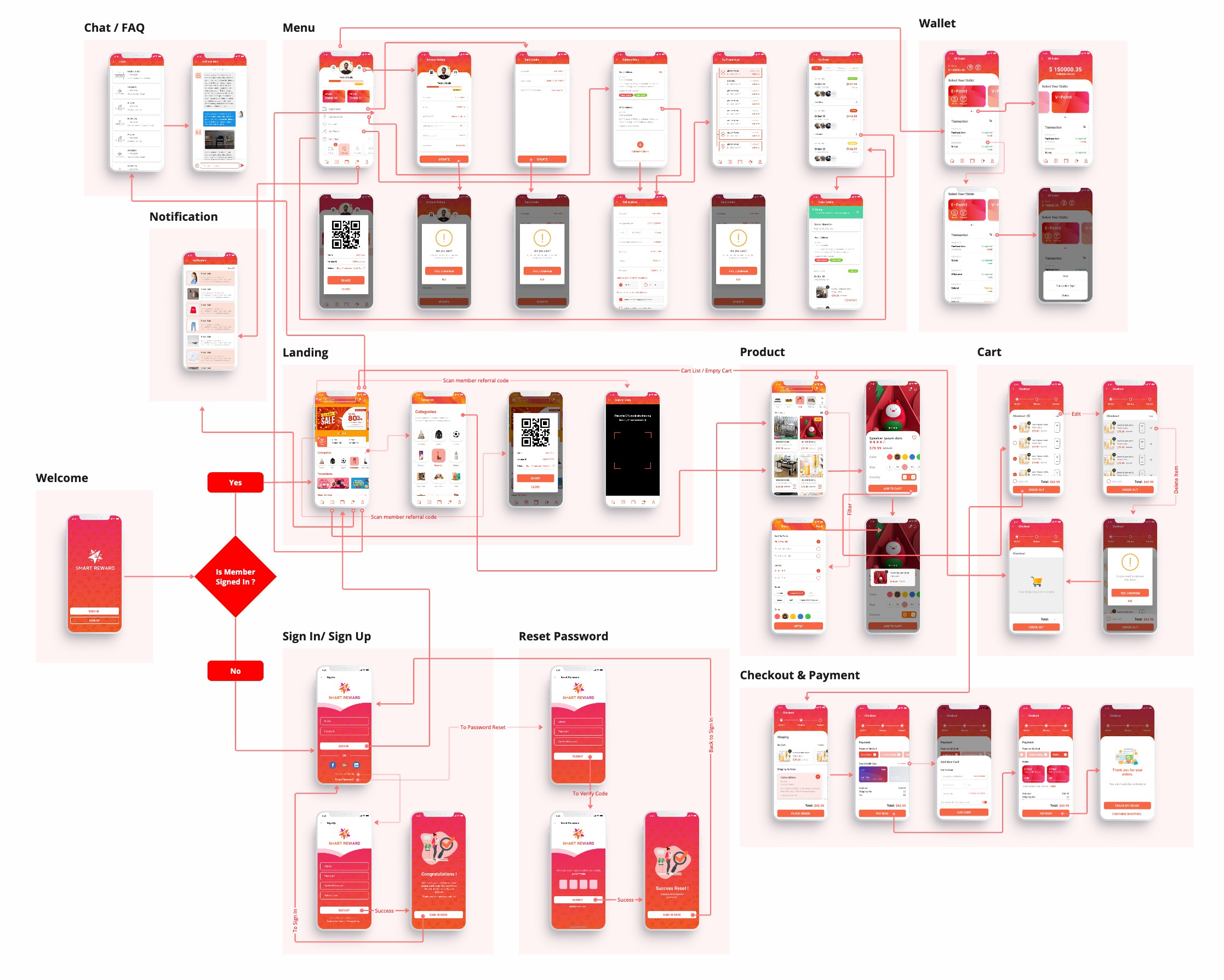
Information Architecture
In the development phase of 'Smart Reward,' a critical step was to design an intuitive and efficient sitemap and information architecture. This process was pivotal in ensuring that the mobile and web platforms offered seamless, navigable experiences, aligning with our business and user goals.
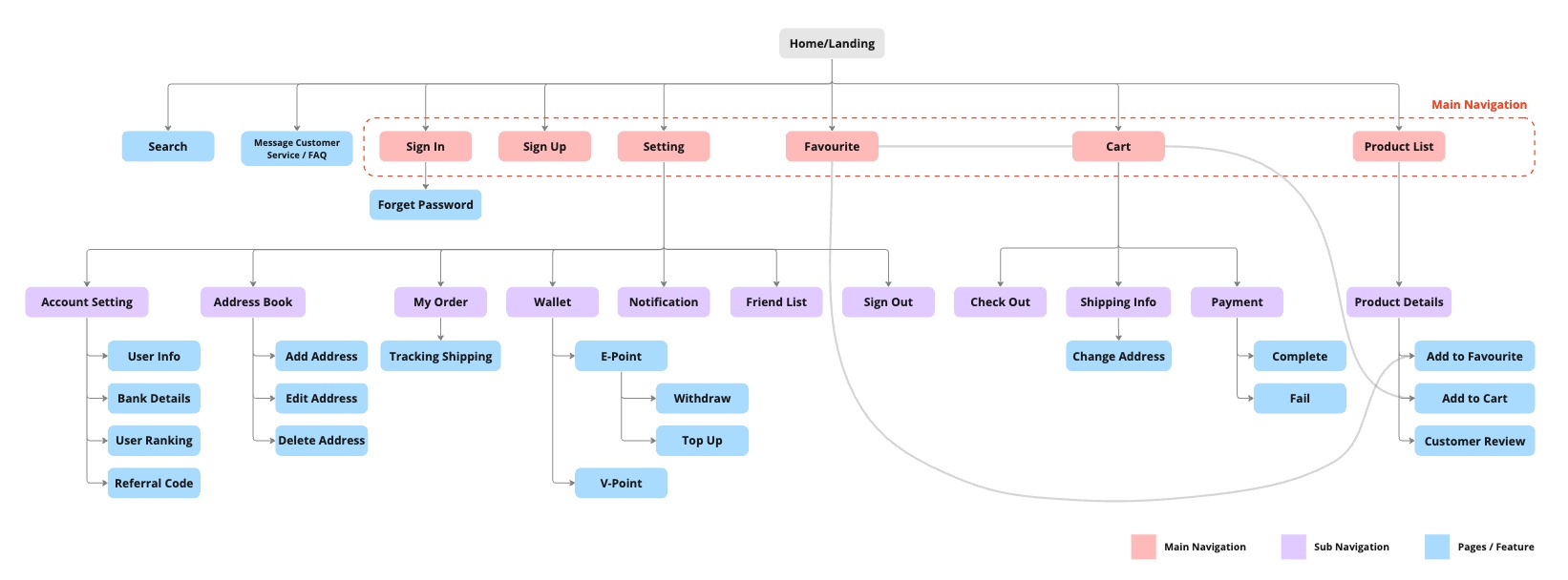
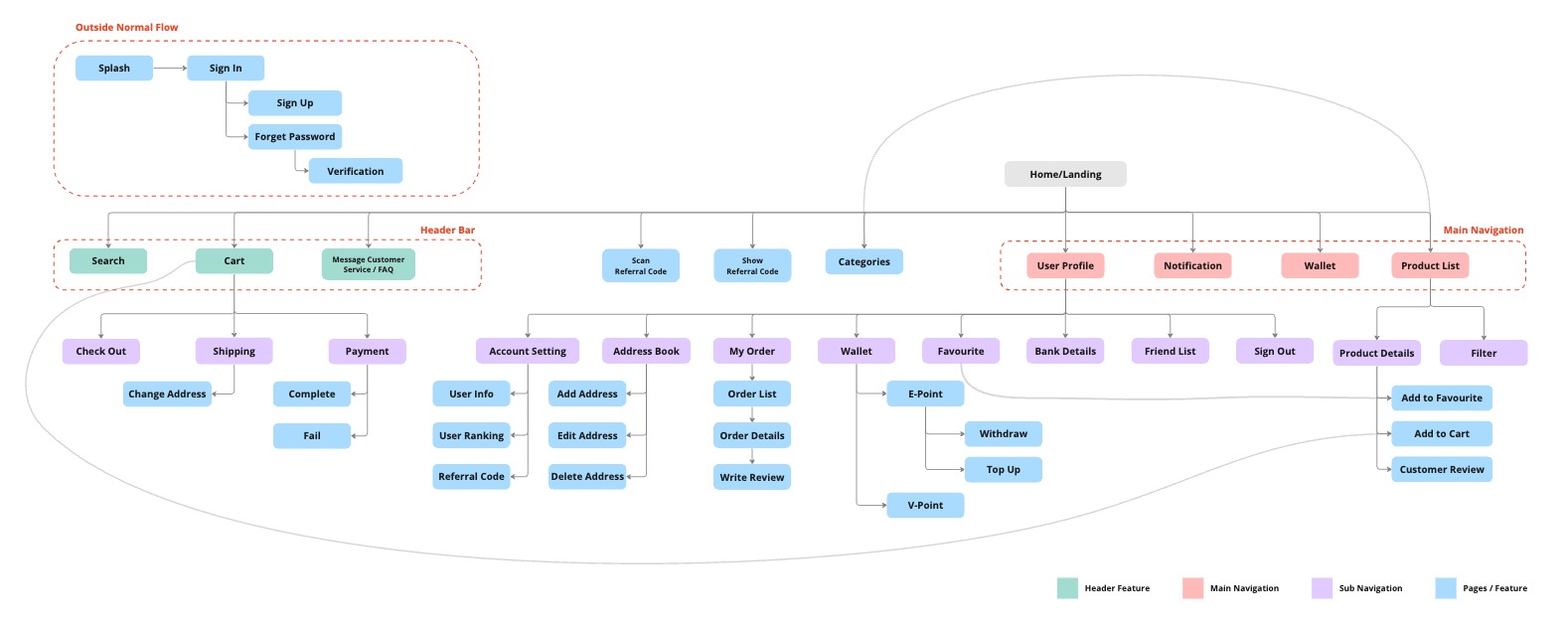
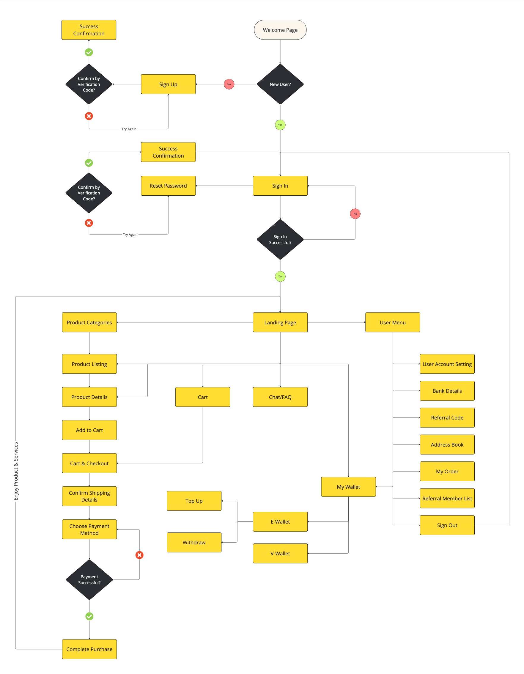
User Flow
Following the site architecture, I laid out the task flow that involves detailing the steps a user takes to accomplish tasks within the app or website, and how information is organized and interconnected.
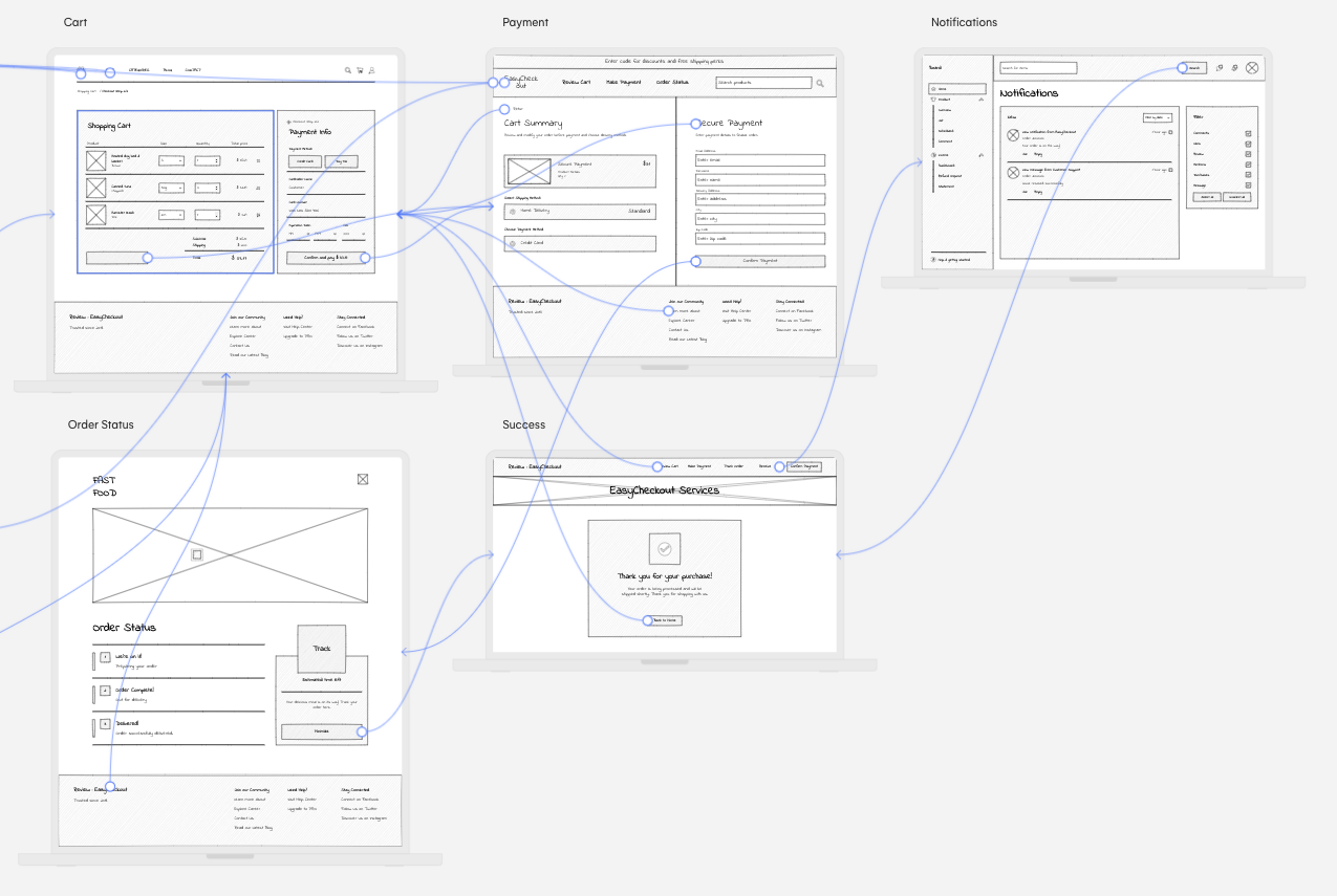
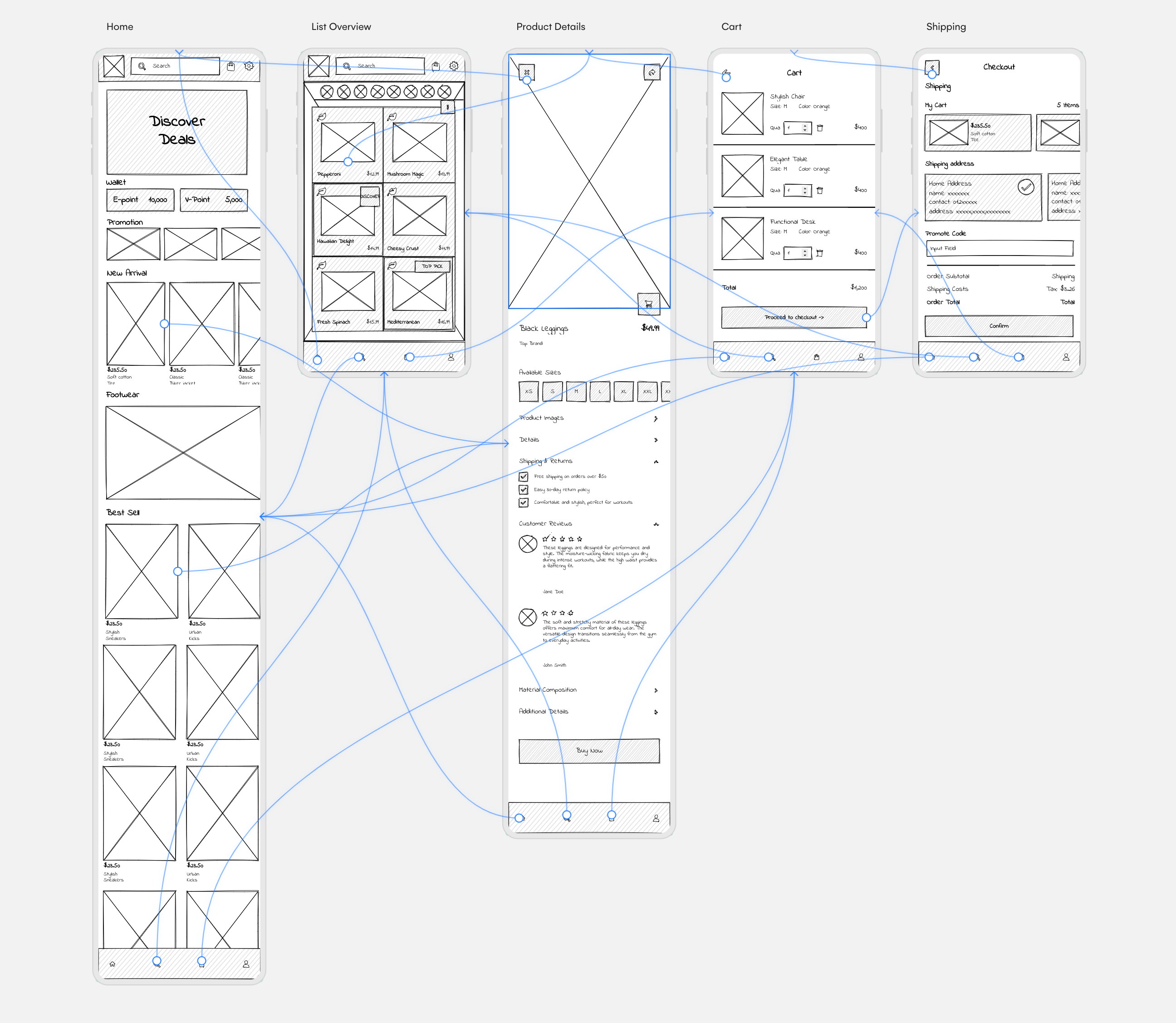
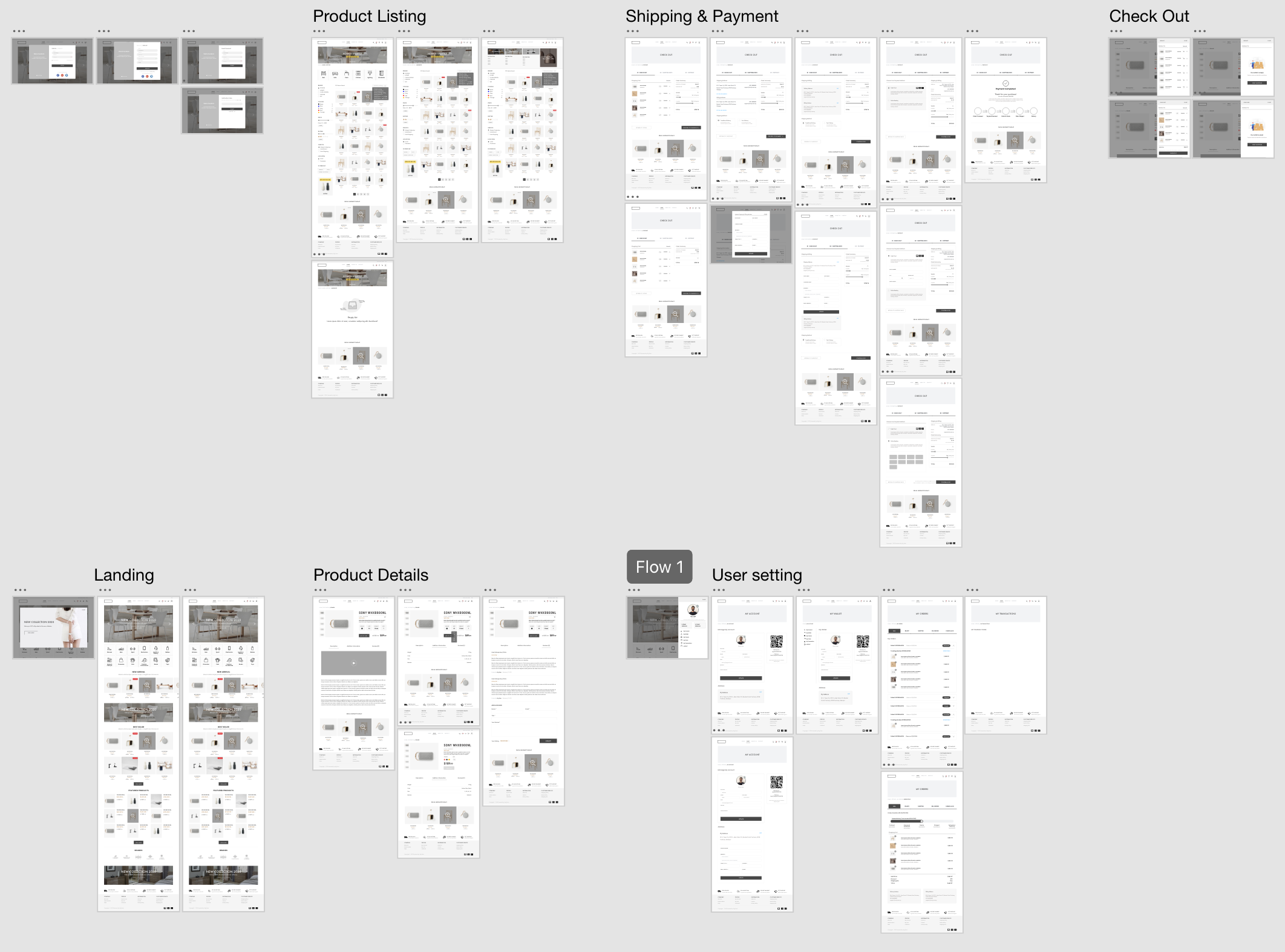
02. Prototyping & Wireframing
We developed initial low-fidelity prototypes that allowed us to experiment with different layouts for the web and mobile interface. The transition from concept sketches to interactive prototypes was a pivotal stage. I led the development of low-fidelity prototypes using Adobe XD, which allowed us to quickly test and iterate on basic layout and navigation ideas. Seeing out concepts take shape and become interactive was profoundly rewarding.
Low Fidelity
03. Usability Testing
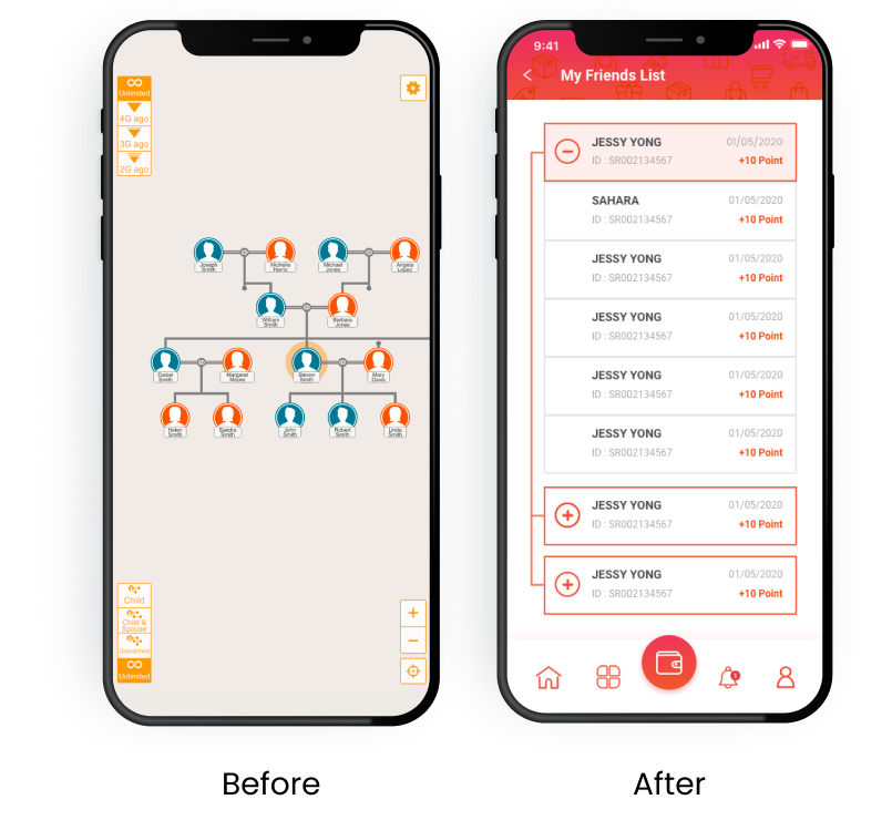
My team and I conducted a series of usability tests through both in-person and remote sessions via Zoom. This allowed us to engage a wider arrays of users and gain more diverse feedback. One of the most challenging aspects we faced was the mobile application family tree feature. Users found the tree layout too complex and the view cluttered. Label were too small to read, and overall navigation within this feature felt cumbersome. These insights came to light during our in-person usability testing sessions, where observing user interactions provided clear evidence of the feature's shortcomings.
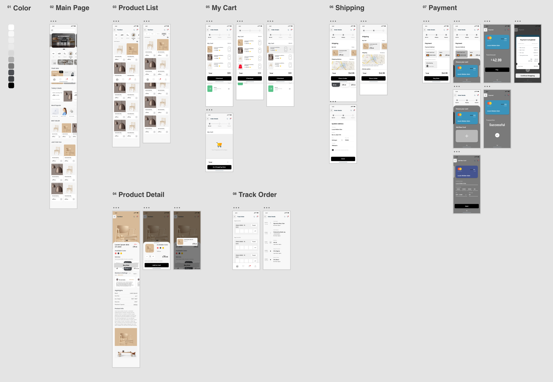
04. Visual High Fidelity Design
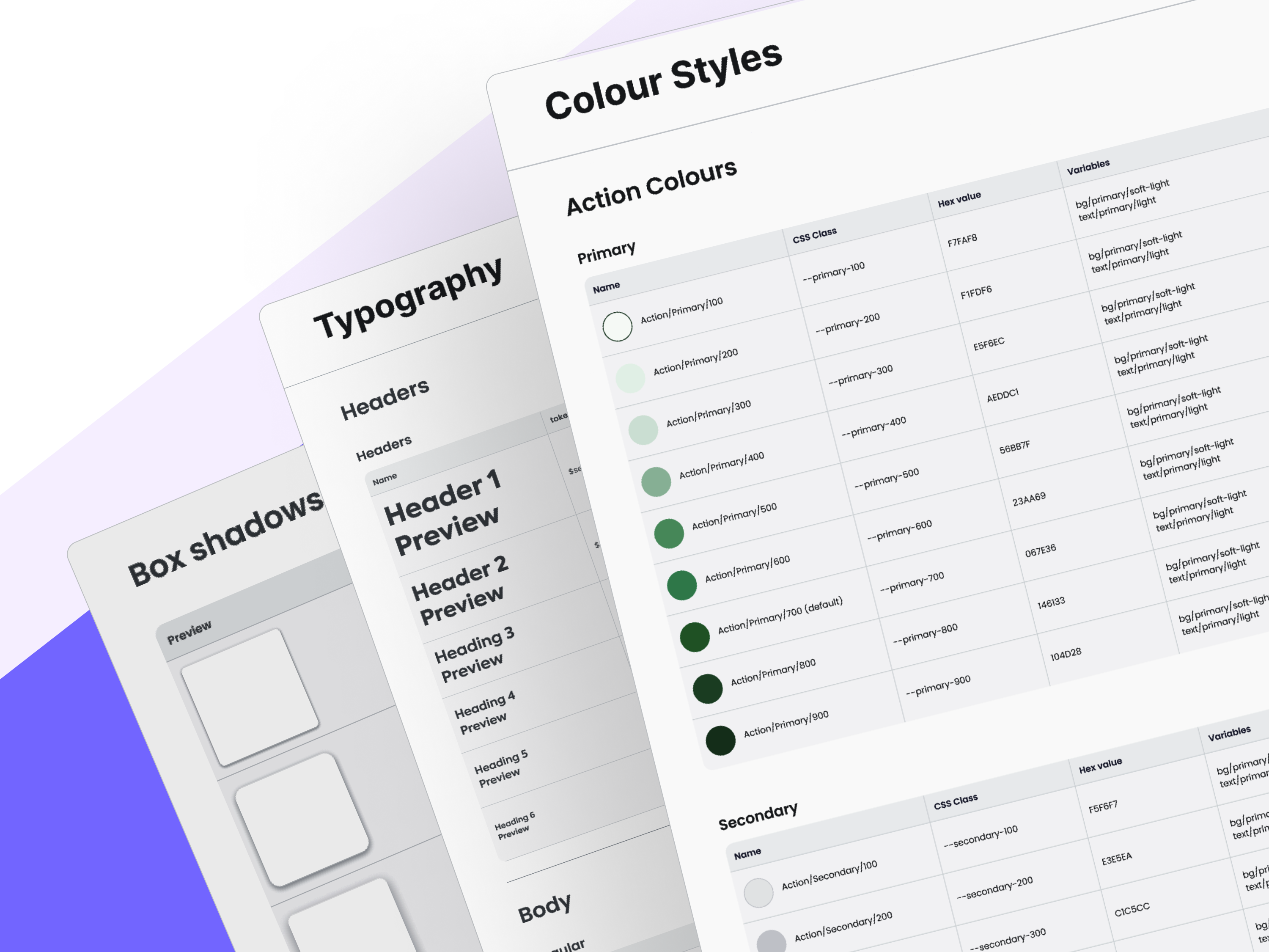
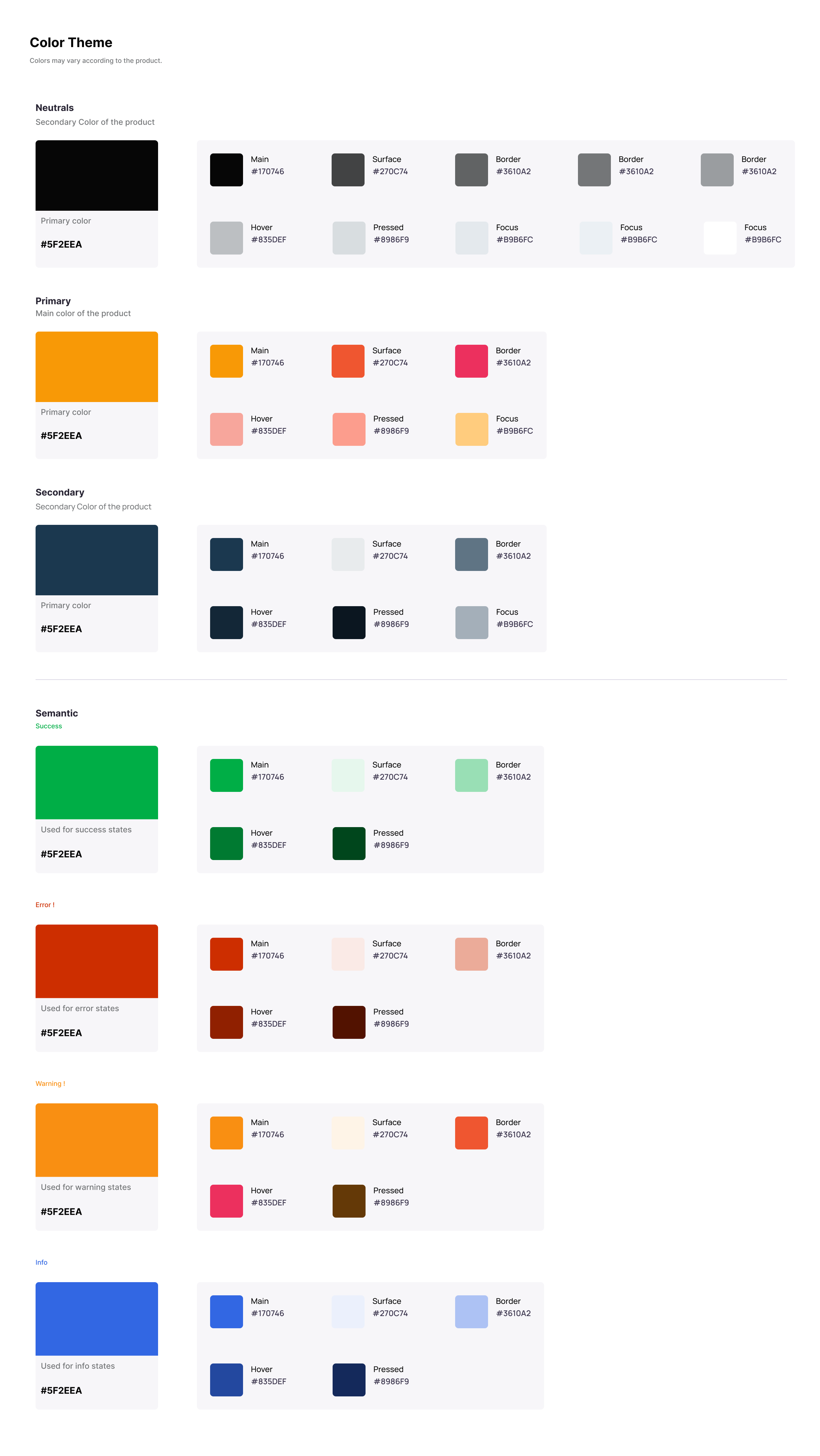
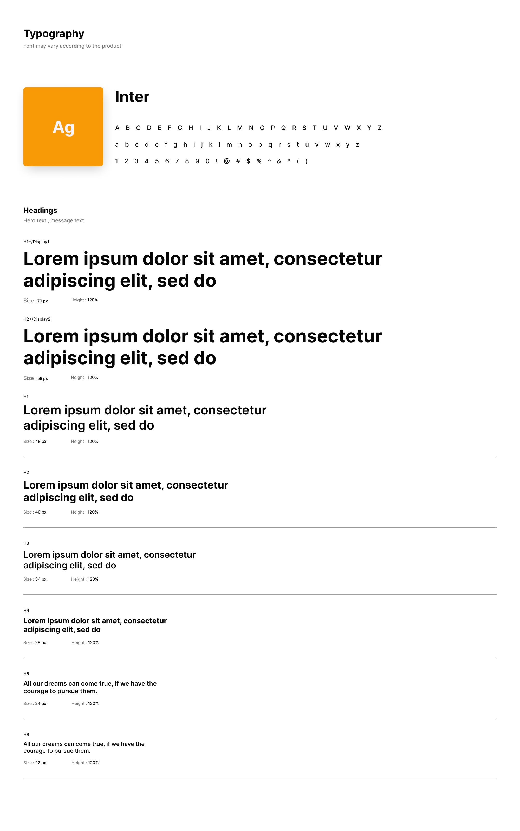
This is not last phase of the design, we developed the final visual style guide and snsured all interactive elements thy are engaging and align with the brand identiy. Attention was paid to the color schemes, typography, iconography, and the overall tactile feel of the application.
Design System
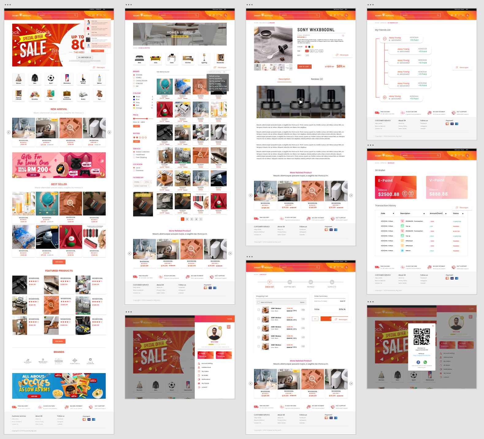
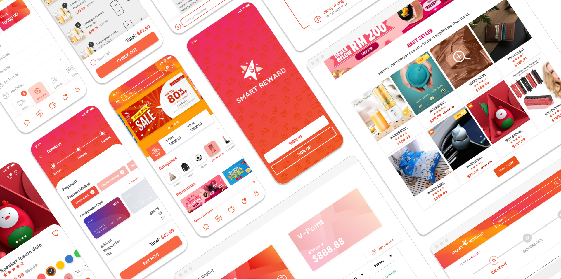
07. Final Outcome
The launch of 'Smart Reward' marked the culmination of countless hours of dedication and teamwork. As we rolled out the platfrom, I felt a mix of excitement and anticipation, eager to see how our target audience would embrace the innovations we had worked so hard to implement. The journey from concept to reality was challenging, yet incredibly rewarding.
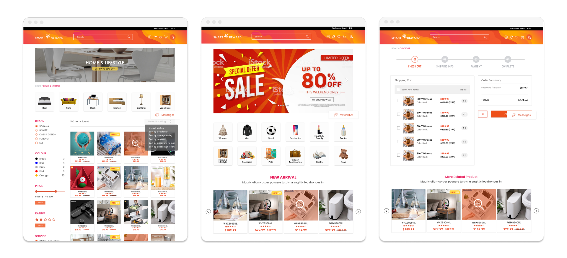
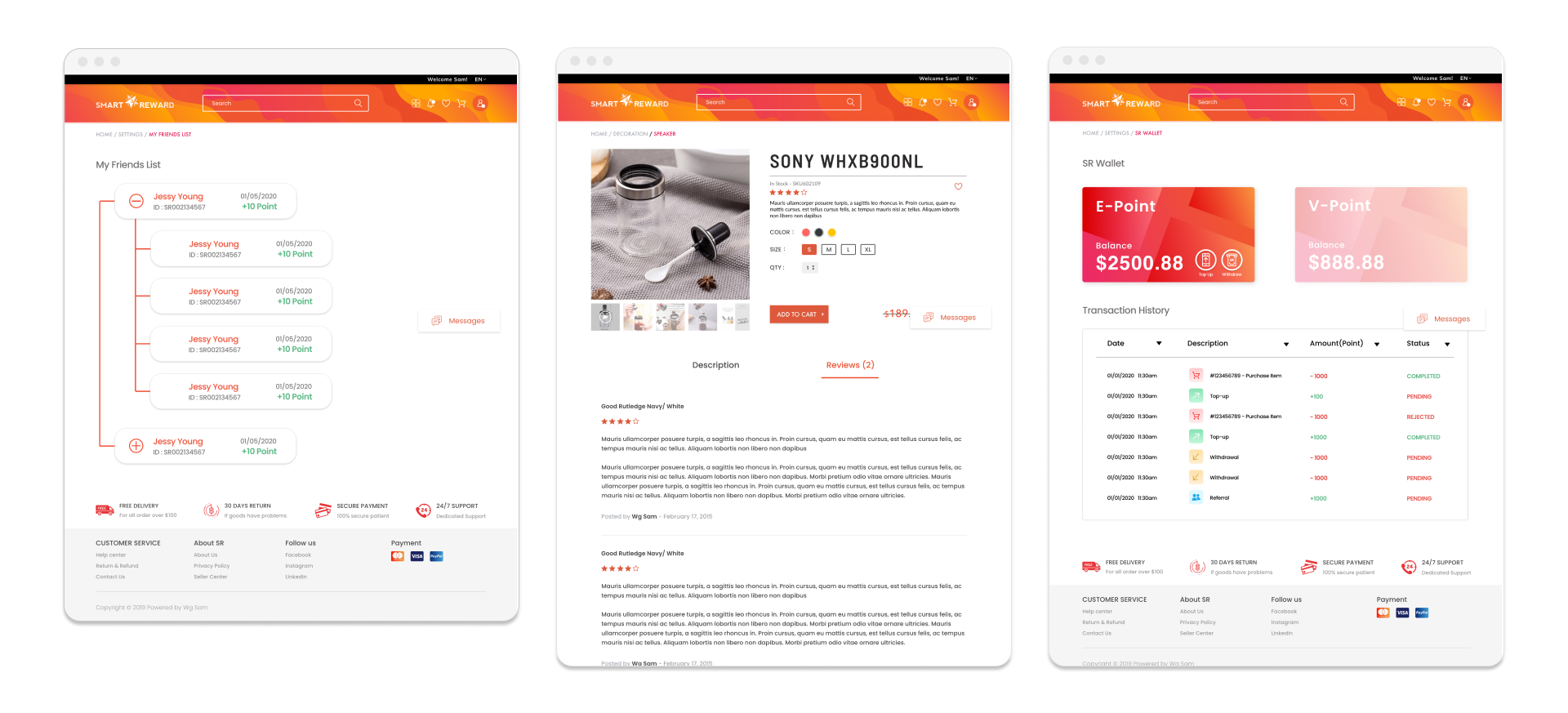
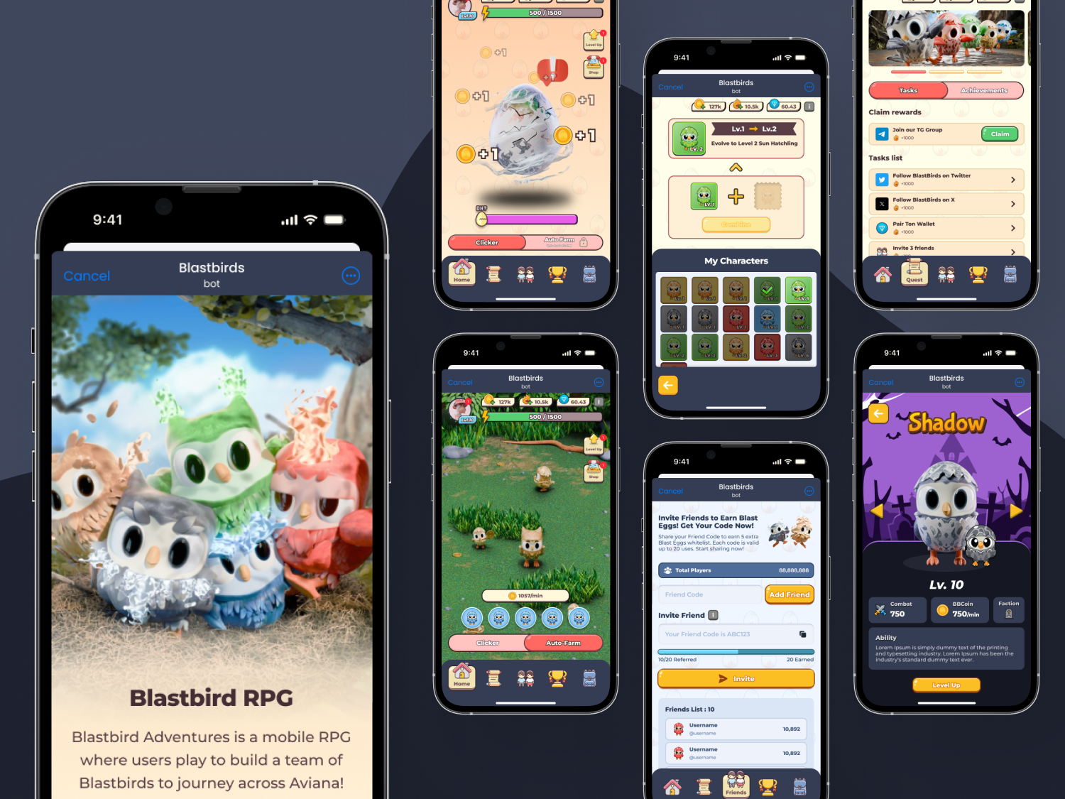
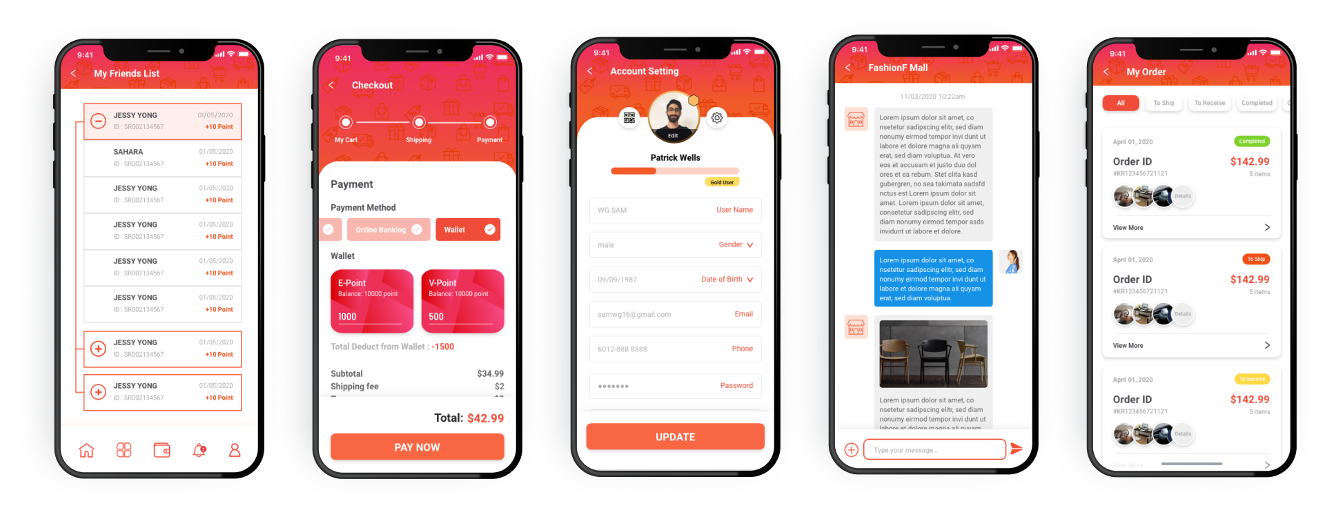
Mobile Final Outcome
08. Project Reflection
Reflecting on the 'Smart Reward' project brings a sense of immense fufillment and insightful revelations. This project not only challenged my design abilities but also deepened my understanding of user-centric development, solidifying my approach to digital product design.
Key Learning:
-
The importance of user feedback:
Work intimately with user feedback throughout this project taught me that the real test of design comes from user interaction.
-
Team Collaboration:
The project reinforced how essential a collaborative team environment is to overcoming challenges. Each team member's unique prespective was invalueable, and integrating these views helped us navigate through the project's most demanding phases.
-
Balance Creativity and Technicality:
Balance the creative aspects of design with technical constraints was a major learning curve. Developing features like the dual wallet system demanded both creative problem-solving and technical percision, skills that I have honed significantly through this experience.
Key Takeaways:
-
Emphasis on User-Centered Design:
My biggest takeaway is the undebiable important of user-centered design. This project validated my belief that understanding and responding to user needs should be the cornerstone of all design efforts.
-
Iterative Process:
I've embraced the iterative nature of design more fully than every before. The process of continual refinement has shown me that perfection is a journey, not a destination.