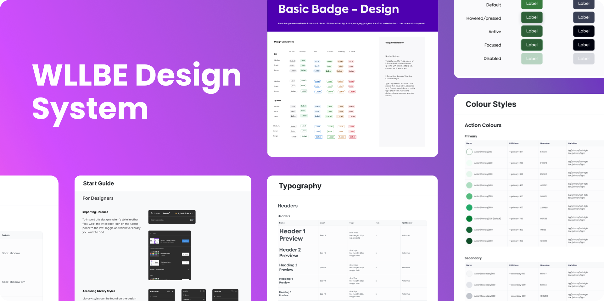
Overview
Main Challenges
Goals
Problem
Process
Finalize
Results
Reflection

WLLBE (Design System)

An In-House Design System for Seamless Control, Accessibility, and Timely Delivery
Worldline WLLBE Banner

01. Overview

Worldline, a global e-payment leader specializing in Merchant Services, Terminals, Fintech, and Mobility & e-Transactional Solutions. When I joined the company, I served as the core UI/UX product designer in a 30-member team to develop an in-house UI/UX design system (WLLBE) for upcoming financial banking projects. The company lacked a systematic approach, with designers and developers initiating projects from scratch, resulting in inconsistent designs and extended project timelines. The goal was to introduce a design system to streamline the process and enhance overall project efficiency.

Client
Worldline
Role
UI/UX Product Design, Design System Management and Documentation
Timeline
May 2022 — Feb 2023
Tools
Figma
Photoshop
Miro
Miscrosoft Team
Project Overview

02. Main Challenges

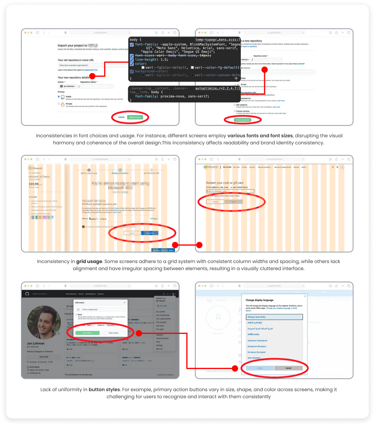
The core challenge Worldline faced was the absence of a unified design system, which led to considerable inefficiencies and inconsistencies across our project development lifecycle. This situation manifested in several critical ways:
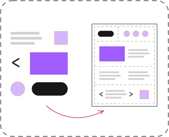
Inconsistent
Inconsistency
Developers encounter difficulties in managing and updating projects with diverse design approaches, resulting in inefficiencies and extended development cycles.
Redo
Recreation
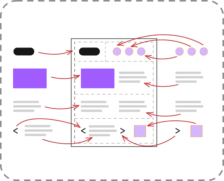
The need to recreate components for every new project introduced unnecessary redundancy and wasted valuable resources.
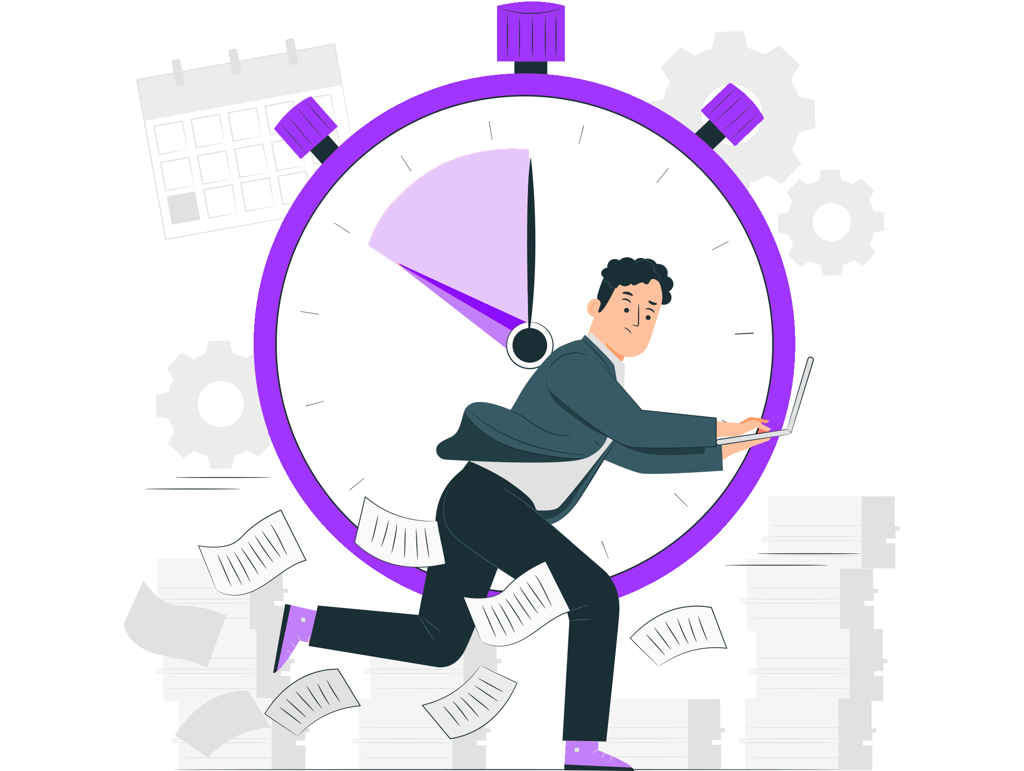
Timeline
Timelines
The lack of a standardized approach significantly prolonged project timelines due to repetitive work and divergent design choices.

03. Goals

The main objectives were to establish a cohesive design language, foster collaboration with development teams, and reduce project timelines. The design system aimed to provide a standardized set of guidelines and components, ensuring a consistent user experience across various banking projects.

Goals
Design System Process
Accessibility & Inclusivity
Designing for the needs of people with permanent, temporary, situational, and acknowledging diversity and difference:
  • Be consistent
  • Give control
  • Easy to access
Dev-friendly
Designing with developers' needs in mind:
  • Scale for responsiveness
  • Choose easy-to-code over fancy-look
  • Be consistent
  • Naming conventions & Tokens
  • Reduce development timelines by 20%
Start Guide

04. Problem

Upon reviewing past projects through a comprehensive site audit, I discovered that the lack of a UI/UX design system led to significant divergence in assets, such as numerous variants of buttons, badges, and other components. This lack of standardization not only slowed down development but also introduced unnecessary complexity into our products, impacting user experience and our brand's cohesive identity.

Without Design System
Every element is coded manually. Developers and designers recreate the same buttons, implement the same colors and design similar views/ pages from scratch every time.
With Design System
With Design System
Every element, whether it's a button, color or font, is pulled directly from the library. Developers simply recall existing assets.
Side Audit
Site audit from May 2022

05. Process

Research & Insights

Starting the journey of creating a design system, I lacked experience in organizing components and documentation. To gain insights, I studied design systems like Material Design, IBM Design Language, Bootstrap, and Ant Design. Though informative, these systems were extensive and offered more inspiration than practical guidance.

To address this, I embraced Atomic Design principles , which helped structure design elements into reusable components, providing a solid framework. This research deepened my understanding and equipped me with practical frameworks, setting a strong foundation for the project ahead.

Atomic Design System
Atomic Design System Stages
Why Atomic Design
  • Modularity: Unlike other methods that may treat components as monolithic blocks, Atomic Design emphasizes modularity, allowing us to mix, match,and reuse parts with greater flexibility.
  • Consistency: Using the same 'atoms' across products ensures a consistent look and feel, which is key for brand identity.
  • Focused Refinement: This method allows us to refine UI elements at the atomic level, which can be more challenging in other design methodologies that focus on larger components oor template first.
Flow Chart

I created a comprehensive flowchart following Atomic Design principles using Mermaid format in Miro. This flowchart serves as a roadmap for developing a design system, guiding the process from defining principles to iterating and improving components.

Design System Flow Chart
The flowchart illustrates the layered approach from Atoms to Pages, guiding the development of the design system.
Atom Design Methodology

Here's a quick peek at how I using this Atomic Design methodology to structured and organized my components, I divide it to 4 separate stages (Atoms, Molecules, Organisms, Templates).

Atoms

Atoms represent the most basic interface elements. They’re the foundation and supporting structure of an interface. Consider them like lego pieces, there cant be break down any further.

Atoms
Molecules

Molecules are groups of atoms bonded together that have their own unique features. I group together the atoms like lego and form it into — a form label, search input field and a button.

Molecules
Organisms

Organisms are relatively more complicated components, composed of groups of molecules and atoms. Examples are navigation, footer, sidebars, forms, etc.

Organisms
Templates

Templates are the glues that combine the different organisms or individual sections to create a complete design.

Templates
Atom Layer
Molecules Layer
Organisms Layer
Define & Ideation

How can I develop a design system that is simple, scalable, and accessible to both designers and developers? – coming from a front-end developer background, I recognized the significance of addressing the needs of developers as well. Therefore, I incorporated tokens, CSS classes, and code snippets directly into the Figma file. This streamlined the process for both designers and developers, enabling them to grasp our thought process and communication efficiently.

Badge Designer
Badge Developer
Button Guidance
Prototype

Although I am the only core designer on the team, I knew the team would house more designers in the future. The system will expand and be used by multiple people. What helped me keep elements scalable was sticking to atomic design principles, using nested components, and using component properties to simplify variants. It’s still an on going learning experience to identify which components will be needed for reuse and which elements are specific for edge cases.

Button Properties
Button Nest
Above, I have shown the properties and variants that my button will consist of, enabling me to create multiple variants and prototype hover states directly on the components.

Each component would have variants and each variant would be correctly named so that when it came to publishing the components it made it easy to understand the state changes and what you can turn off and on to get the desired component.

Button Set
Nesting Components
Nesting components, I keep small components resuable so I can nest them in large components like this form. This makes designing for responsive website a lot faster.

06. Finalize

Components Library

Here's some of the final Version 1.2 of the design, and it will continue to be iterated upon in the future.

Design System Work
Design Work
Documentation

The documentation for the design system is integrated directly alongside the components, offering clear explanations of their purpose and usage. It includes visual examples, and guidelines for implementation, covering design principles, accessibility standards, and brand governance.

Documentation

07. Results

The use of the design system has save time in creating new projects. We don't need to create UI kit mockup, components, design system, design guidance, and prototype any more.

30%+

Reduce UI Development time

20%+

Faster Delivery
Checklist Consistency
Checklist Easy Acess & Control
Checklist Dev-friendly
Checklist Save timeline
Actual Timeline
Result Timeline

08. Project Reflection

What's Next?
  • Continuous Improvement and Adoption:
    We'll keep refining the design system based on feedback and evolving project needs. This includes updating documentation and providing training to ensure widespread adoption across the organization.
  • Expansion and Engagement:
    Let's explore opportunities to expand the design system's usage to other teams and projects. We'll engage with the design community, sharing our experiences and learning from others to further improve our practices.
  • Feedback Integration:
    Establishing a feedback loop with stakeholders and users will be key. We'll gather insights to refine the design system, ensuring it continues to meet the evolving needs and expectations of our projects.
Future Plan
Thorough Design System Documentation:

One of the key takeaways from this project is the importance of comprehensive documentation. Looking ahead, I recognize the need to invest in thorough documentation that covers everything from design principles to coding standards. This documentation will serve as a valuable resource for our team, facilitating efficient onboarding and ensuring consistency in implementation.

Establishing Governance Structures:

As we continue to evolve our design system, it's essential to establish robust governance structures. I intend to define clear roles and responsibilities, establish decision-making processes, and implement version control mechanisms to maintain the integrity of the design system. By formalizing governance structures, we can ensure accountability and alignment with organizational goals.

Looking back, the project was not just about creating a set of tools; it was about fostering a culture of efficiency, consistency, and inclusivity. The path ahead is promising, and I am eager to see how the WLLBE design system will continue to evolve, improving in the products and the experiences of those who use them.